Screenshots are incredibly important on the App Store. In the search results section, you have three vertical, or one horizontal screenshot that is displayed in order to quickly introduce and convince someone that your app has features that they’re looking for. Therefore, you should be giving considerable thought and effort towards perfecting your screenshots and the messaging within them.
One important aspect of your screenshots is your callout text. We all know a picture is worth a thousand words, but sometimes it’s nice to have an accompanying text element, explaining exactly what the user is looking at. Let’s look at some key aspects you should consider when crafting your screenshot callouts:
Highlight relevant features
If you remember our article on Dunkin’ Donuts’ ASO, then you know that we had some recommendations for their screenshot callouts. One way their callouts fell short was that two of the five screenshots featured callouts that were emphasizing the app’s recent redesign and not its functionality. By examining your app’s reviews, keyword metrics and app usage, then you can figure out which features of your app your users love and highlight those to attract downloads and reinstalls.
Focus on readability
One common error that apps make with their screenshots is having callout text that is way too small. You aren’t designing a billboard, but in the same token, consider how the text looks in search results. Text that is too small will not provide the same value if users are not able to read it!
Be concise
It’s a callout, not an essay! The longer you make your callouts, the harder they’ll be to read. Each callouts should tell the user one thing that they can do from your app. Don’t tell them every feature in one screenshot – that’s way too much text!
Real life examples
Let’s look at a few examples of some text callouts:
Skype vs. Google Hangouts
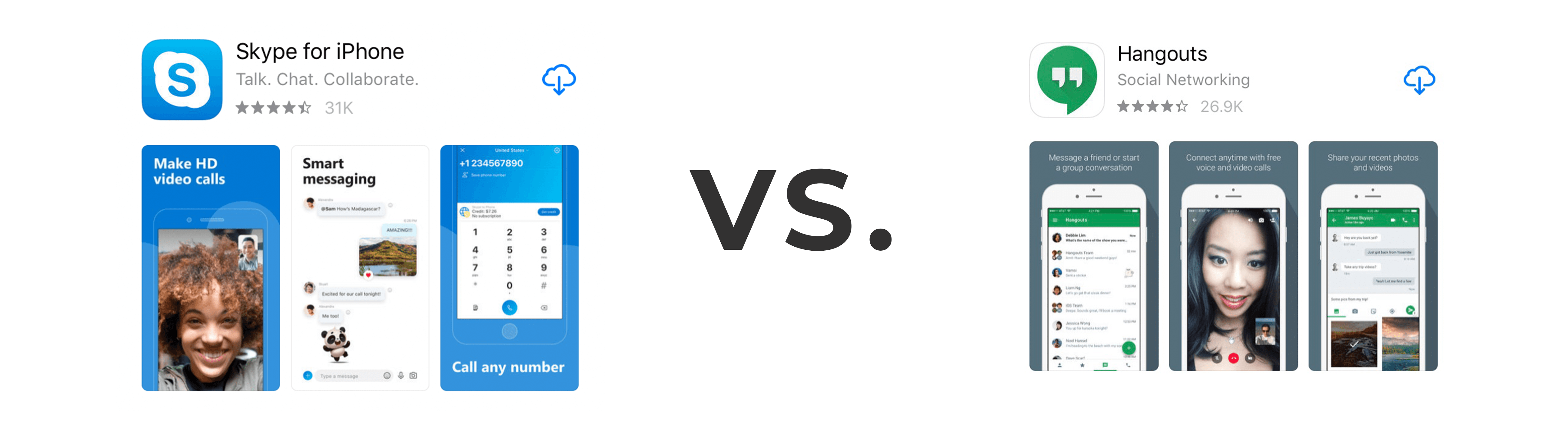
Skype does a great job of giving you three excellent reasons to download their app. You can make HD video calls, message people and call anyone. Those are three important reasons to download their app and probably three of the main reasons why any user would. The callouts are clear, concise and to the point. They’re also large and standout against the background. On the other hand, the text callouts for Hangouts are a bit difficult to read, and the font is extremely thin, making it even more difficult. While they’re messaging is effective and highlights their main features, if a user can’t read it, it doesn’t matter!
Apple Music vs. Musi
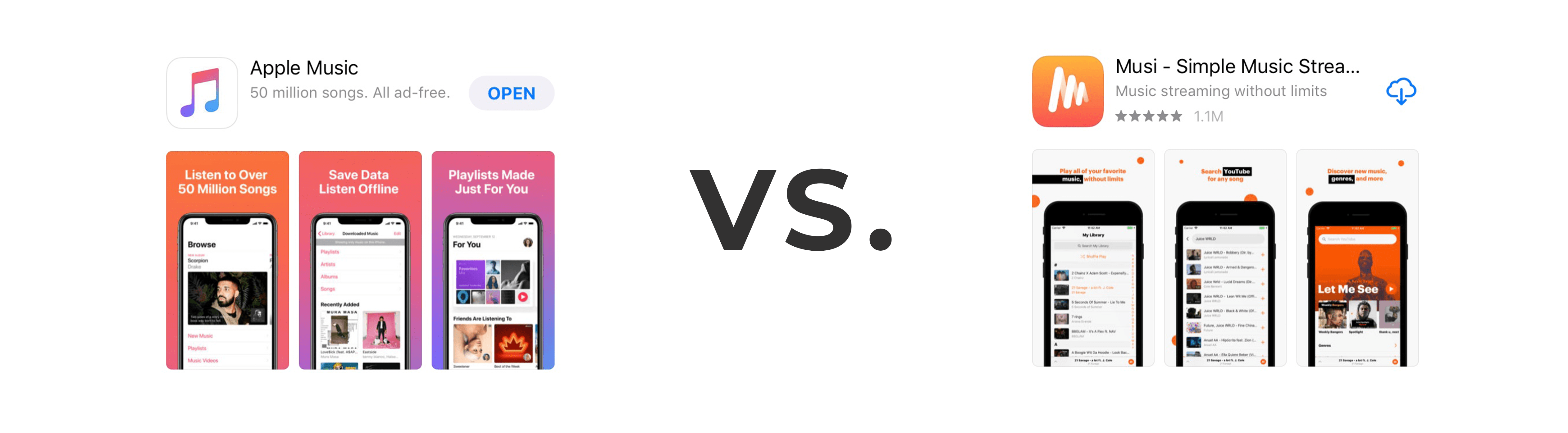
Apple Music uses callouts that are large, stand out and tell you exactly what you need to know. If you want to listen to millions of songs, listen offline and have custom playlists, download Apple Music. What does Musi offer? After squinting, I see that I can play all my favorites, search Youtube and find new music. Similar to Hangouts, these callouts contain extremely effective messaging and provide a compelling reason to download the app, but they’re just not readable! It looks like Musi has enough empty space at the top of the screenshots where they can afford to increase the text size of the callouts without losing the design aspects of the screens. Increasing size of the text would help to convey the main features of the app and attract more users.
Callouts can help make or break a users’ decision to download your app. Crafting callouts that encourage a user to download your app is extremely important. Not only do you need compelling callouts, but a user has be able to actually read them.