You don’t have to be a branding expert to see the difference in aesthetic between Apple’s App Store and Google’s Play Store. Because of the unique differences in the stores’ individual user experience and interface, it’s important to understand the various graphic elements and how to best design for each app store. Today we will talk about a few differences you should be aware of when designing for the App Store vs. Play Store:
First impressions
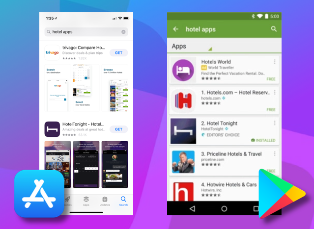
When you search each store, you can immediately see the difference in which graphic elements carry more weight. The App Store puts a lot of weight on your app’s screenshots. The Play Store really leverages app icons in search results.
ASO Protip: Did you know that the App Store just allowed 10 screenshots to be uploaded? Read more here.
The Perfect Product page
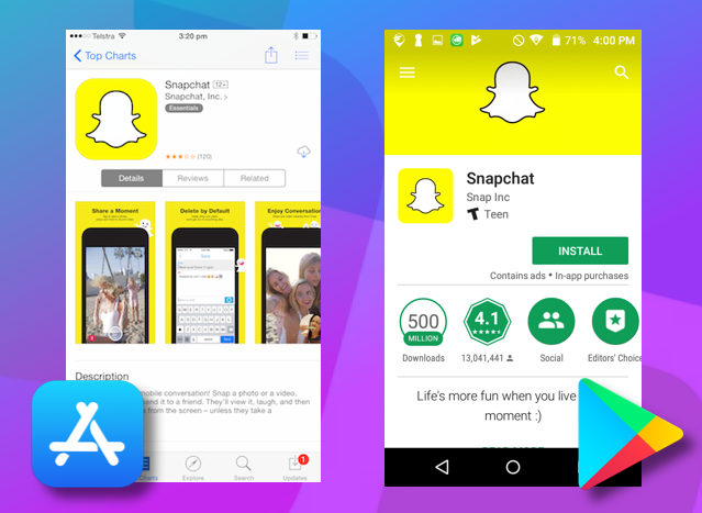
What is the perfect product page? Well, the App Store and Play Store have differing opinions. The App Store loads screenshots as the central focus on your product page vs. Google Play prominently displays your header image as the main focus.
Uniform vs. Irregular Icons
Apple has long been praised for its minimalist brand look which plays out across device UI and even in the App Store. The uniform shape of iOS icons is a rounded square which keeps the general look of the store clean and kept. Android icons, however, allow for opacity levels and cutouts which create irregular shapes.
For example, look at the differences between Yelp’s icon for the App Store vs. the Play store:


Regardless of the difference between the appearances of the two stores, there are a few best practices that apply for both stores.
- Make the most of your app’s screenshots and header image: include your key messaging/features on the first 3 screens or your most value-adding copy on your header image.
- Create an eye-catching icon that works in your category and niche.
- Test your creative to see what works. Don’t guess at what’s best! Split tests assure you are using the most efficient graphics.
For more actionable advice on how to improve your product page graphics, visit our previous post: 5 Reasons to test new graphics in the App Store
Get your graphics on
Not a pro at designing for the App Store vs. Play Store? We’re experts at creating high-converting graphics for both the App Store and Play Store and backing up those decisions with data from A/B tests.