Google has been slowly overhauling the Play Store and Play Store Console since it’s I/O 2019 conference. In the past few days, it’s officially rolled out its redesign of the Play Store. To say that the Play Store has changed a little would be an understatement. Let’s look at how the Play Store has changed:
Rounded Rectangles Everywhere
It seems Google has a newfound affinity for rounded corners on squares and rectangles. Everything from install buttons to app icons have rounded corners. Even screenshots are displayed with rounded corners now.
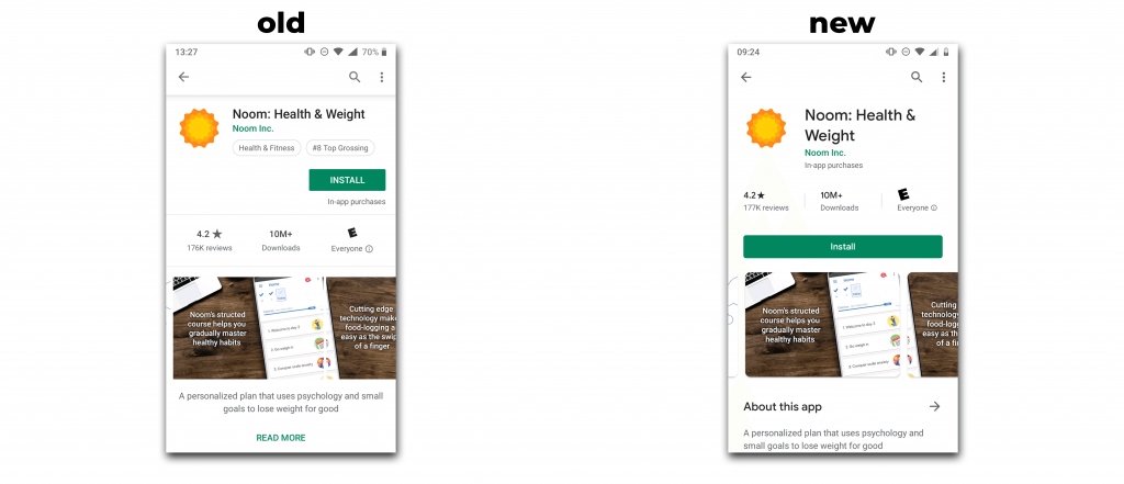
As you can see from the two screen grabs above, the rounded install button now takes up nearly the entire width of the device screen. The same is true if you have a “try now” option for your app, with the two buttons stacking on top of each other.
The new rounded icons are part of the icon design specification changes that Google rolled out in June. Having specifications for icons makes for a cleaner, more uniform look across the Play Store. On June 24, Google changed any un-updated icons to “legacy icons” — meaning that your original icon that doesn’t meet their new dimensions was automatically resized to fit with a white background. If you haven’t updated your icon and it’s currently in “legacy mode”, we highly recommend you do so immediately to fit into the new Play Store design.
New Screenshot Sizes
While the rounded screenshots on the Play Store don’t appear to have a *huge* impact on your app listing design, there is a huge new development for screenshots. If you saw our article on Play Store short descriptions, then you remember that we discovered that screenshots on Play Store listings could be different sizes. It appears as though this may no longer be a problem. Check out the difference between Play Store screen grabs from a few weeks ago versus some taken after the redesign.
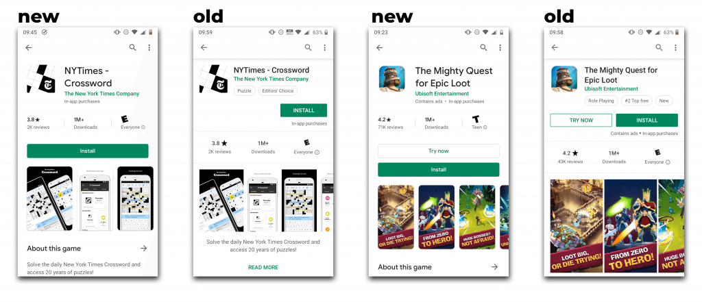
Before, vertical screenshots could be any sort of size or dimension. Now, it appears as though Google is making them much more uniform on the app’s page. Screenshots also seem to be smaller in most listings, so developers need to pay attention even more to their screenshot design when it comes to the legibility of the text and graphics in order keep conversion rates high.
Description Reformatting
Prior to the re-design, your short description was one of the first visible text elements for your app (behind your title of course). Now, it appears as though Google might be putting a little more stress on the description with a “About this game” indicator above the short description. Tapping on that button opens the app’s description.
While this shouldn’t negate the importance of having a compelling short description, it may increase your long description’s impact on conversion rates. While the description on the Play Store has always been important from a keyword standpoint, it seldom played a significant role in conversion rates Make sure your description is more than just keyword stuffing!
If you’re wondering how the new Play Store design changes your app’s listing, contact us today for an analysis on conversion rate opportunities and necessary changes!