We all know that creating a long-term successful app is not a post-and-pray scenario. It takes a lot of planning and time to achieve such a feat. So why do so many developers treat making it into the app store as the final step to bringing their app to market?
In today’s Tips & Tricks, let’s look at A/B testing and how it can help your ASO strategy.
First, let’s define what A/B testing is:
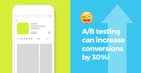
In ASO, A/B Testing (also known as split testing) is the process of selecting an app store variable and testing different versions of that singular variable to see which rendition converts the highest number of users. In our ASO strategies, Search Visibility is the #1 priority, but Conversion Optimization is a very close second. Your app can be ranked first for all of your major keywords, but if you’re converting only 10% of users that view your app, you’re missing an enormous opportunity. With our clients, a well constructed A/B test has proven to increase conversions by 30%! 😯 Imagine if you were able to convert 30% more of the users that view your app’s page!
So let’s look at the different variables that apply to your app and how to use them for optimizing:
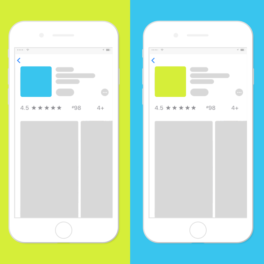
Icon
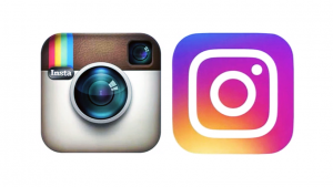
The icon is another impactful test variable. Remember how everyone made such a big deal about the Instagram icon update? Talk about a trend setter (we see and design a lot of white icons on gradient backgrounds these days).
A good icon design can catch attention, pull users in, and even become an iconic brand. The icon is really the first impression that your app gives to a user. On both stores the icon is front and center in Search, Categories and pretty much the entire storefront.
When A/B testing an icon, you want to understand, and test, a lot of different things so that you can make sure your icon either differentiates your app from the rest or aligns well with the top competitors. By understanding your competition, determining your app’s messaging and experimenting with colors/graphics you’ll be able to see what attracts the most users to your page. This is the first step in starting an A/B test. Next, design and implement! The length of tests will vary based on the amount of traffic that your page receives. One of the biggest mistakes that we see developers make is that they’re testing very subtle or insignificant changes. If you’re going to take the time to run a split test, try to make sure the icons are different enough that users see two (or more) distinctly different icons.
Icon testing is even more relevant for Android apps because it is the basis of search results versus iOS apps which show icons and screenshots/previews in search.
Short Description (Android)
The short description in the Play Store is always under appreciated, but is incredibly valuable. You have 80 characters to introduce your app, and inject keywords, in order to garner interest in your app. Users don’t even see the long description without tapping on the short description which in turn opens a new view. It’s important to not only use important keywords here but to also add a cohesive value proposition. Test a variety of calls to action and/or key points of difference (from competitors). Understand what users like about your app, and ultimately what they’re looking for in order to introduce those points in your short description.
Header Image / Feature Graphic (Android)
Second to you app’s icon, the Feature Graphic is generally the next piece of your app that a user sees. Largely visible in the app listing, the feature graphic sits on top of the rest of the content and provides ample space to introduce a key feature, or highlight the benefits of your app. The Feature Graphic in the Play Store can be a static image, or will have a “play” button overlaid for apps with a preview video. Much like the short description, the Feature Graphic provides a fantastic opportunity to quickly introduce your app and give off a positive first impression.
Video & Screenshots
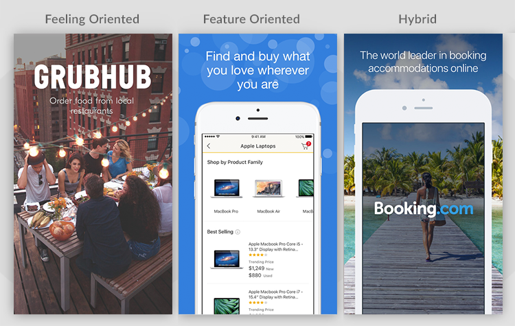
Especially for iOS, these are your major creative real estate. With the update of iOS 11, users will be able to see your first 3 screen shots. There are different styles that are most appropriate based on your app’s category.
Store Maven defines them as either being Feature Focused or Feeling Focused (or a hybrid of the two). By this, it is meant that your creative can either attempt to focus on the culture your app creates for your users or the unique value your app provides for your users. Check out their example below or read more about Why you should test new graphics in the App Store.
And that is A/B Testing for ASO in a nut shell. Who knows? You may just be on the receiving end one of our tests right now… 😉
Want to learn more about how we can help your app with a dedicated ASO strategy? Request a consultation right now!