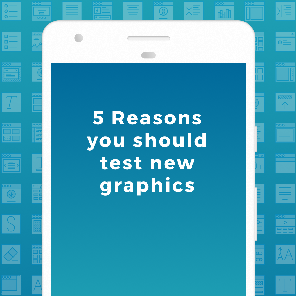
Does your app need a facelift? – Here’s why you should test new graphics in the app stores
There are so many apps in every category on the app stores. How on earth are you supposed to stick out from the masses and make users consider downloading your app? The answer is to use creative optimization as a part of your ASO strategy.
The best way to catch user attention during their “Search & Scroll”, is to have attractive icons and screenshots. Here are 5 ways you can alter your graphics to better your chance at snagging those installs!
Contrasting colors, or blend in?
Check out your competition. There are a few things you should be considering: Is there a category leader? Are there a lot of copycats? Should you wildly contrast your app’s color palette? Should you try to blend in with the competitors? You don’t know until you test! A common mistake we see developers make is starting off with tests that are far too subtle. If you haven’t tested your graphics yet, try renditions with different styles, blending in with the top competitors, drastically differing and continue to zero in on the best set for you.
Use descriptive text on your screenshots
Keep the text in your screenshots clear and concise. Utilizing short call outs that emphasize your app’s key features are beneficial in persuading users to install. Users want clear and concise information about your app, and a lot of users don’t even read the description!
Showcase your app in a device, the way the user will experience it
A common and often times successful design trend is to use mock devices with screenshots of your actual app’s UI. This works because the user knows exactly what to expect when using your app. Try experimenting with how the devices are displayed, angled and colored in order to maximize the effectiveness and conversion potential.
Think outside the box(es)
A major trend in 2017 is to create a continuous graphic that is split into multiple screenshots. Think outside the box when designing your screens and try letting elements (like objects, devices, or screens) drift across the border of one screen shot and into the next. This creates a unique viewing experience that shows users your app might just be worth a shot! On iOS the first two screenshots are visible in search (the first three will be visible in iOS 11), so it’s a great opportunity to catch a potential user’s eye.
Split test for success
A great feature in the Google Play Store is the ability to run split tests. This allows you to split test on-page elements to determine the most conversion-efficient variant. We are huge advocates for testing over and over until you’ve found a winning graphics aesthetic for your app. For iOS apps, there are a number of service providers that provide the ability to split test with replicated.
Ready for a redesign and conversion boost?
The ASO Project has designed featured app graphics for many of the world’s leading apps in all store categories. Contact us today for a custom quote on App Store Optimization and Conversion Optimization! Happy optimizing!