

The Scientific Method of A/B Testing
It's easy to run a split test in the Google Play Store. Simply set up your test, add a few variants and start the test. Even though it's that simple to start a split test, the key is making sure you're running an effective test, one that is based on hypothesis and reason. Let’s step back into your sixth grade science class where we learned about the scientific method. First you ask a question, do some research, create a hypothesis, run an experiment and then, if that experiment worked, you’re done — but if it didn’t you go back and try again.
It's crucial to apply the same concept the split testing in order to create effective and worthwhile tests. Here’s how:
 The app page in the Google Play Store has a number of elements that are typically "above the fold" (visible without scrolling) on most devices. Almost all of these elements are things that can be split tested. Again, the icon and app title are the top elements on the page and will continue to provide a good opportunity for testing when it comes to on-page behavior. The next two elements to focus on would be the screenshots and the short description. Multiple screenshots are visible on most devices (depending on device and horizontal/vertical layout), but they're relatively small, especially in comparison to the App Store. Your app's video will also be listed first, ahead of any screenshots. In the App Store, Apple forces you to choose a poster frame from your video, but in the Google Play Store, you have the option of uploading a "Feature Graphic" which would become the video's poster frame.
A consideration for split testing your app's screenshots and feature graphic would be text size and visibility of the UI. The short description is the first piece of text (outside of the title) that the user sees when they're on your app's page. The short description is a fantastic opportunity to work on highlighting your app's main features and seeing what users are generally attracted to.
The app page in the Google Play Store has a number of elements that are typically "above the fold" (visible without scrolling) on most devices. Almost all of these elements are things that can be split tested. Again, the icon and app title are the top elements on the page and will continue to provide a good opportunity for testing when it comes to on-page behavior. The next two elements to focus on would be the screenshots and the short description. Multiple screenshots are visible on most devices (depending on device and horizontal/vertical layout), but they're relatively small, especially in comparison to the App Store. Your app's video will also be listed first, ahead of any screenshots. In the App Store, Apple forces you to choose a poster frame from your video, but in the Google Play Store, you have the option of uploading a "Feature Graphic" which would become the video's poster frame.
A consideration for split testing your app's screenshots and feature graphic would be text size and visibility of the UI. The short description is the first piece of text (outside of the title) that the user sees when they're on your app's page. The short description is a fantastic opportunity to work on highlighting your app's main features and seeing what users are generally attracted to.
Back to the blogDo some research
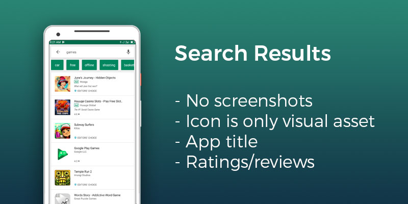
When you’re A/B testing your app's on-page elements, the question you’re ultimately trying to answer is “how can I increase my conversion rate?” The first step is to understand the layout of the Google Play Store and understand what the user will see as a first impression. On the search results page in the Play Store, the two "split-testable" items are your apps icon and title. The icon is the first visual asset a user will see, and the title is the main way for a user to get an idea of what your app is. In the Google Play Store, users do not see your app's screenshots in search results as they do in the App Store. The icon and app title are the only elements that you can split test that will be visible in search results.
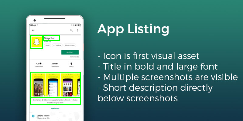
The app page in the Google Play Store has a number of elements that are typically "above the fold" (visible without scrolling) on most devices. Almost all of these elements are things that can be split tested. Again, the icon and app title are the top elements on the page and will continue to provide a good opportunity for testing when it comes to on-page behavior. The next two elements to focus on would be the screenshots and the short description. Multiple screenshots are visible on most devices (depending on device and horizontal/vertical layout), but they're relatively small, especially in comparison to the App Store. Your app's video will also be listed first, ahead of any screenshots. In the App Store, Apple forces you to choose a poster frame from your video, but in the Google Play Store, you have the option of uploading a "Feature Graphic" which would become the video's poster frame.
A consideration for split testing your app's screenshots and feature graphic would be text size and visibility of the UI. The short description is the first piece of text (outside of the title) that the user sees when they're on your app's page. The short description is a fantastic opportunity to work on highlighting your app's main features and seeing what users are generally attracted to.